t seems that every website now has a beautiful slider on its homepage. This post outlines how to use Smart Slider 3 a fantastic free plugin from Nextend to create sliders – either as a main feature on a homepage or as content on any post or page. However, as I explain how to use this Plugin, I must also caution that homepage sliders are not always the best option – visitors to your website may not engage with them. Having a slider as the main content on your homepage will negatively affect conversion goals.
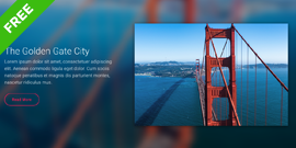
This is the demo slider (with some configurations to add thumbnails explained below) that comes with the plugin which allows you to add BIG HEADINGS, Text paragraphs and Buttons to direct your website visitors to specific pages and posts. Sliders are a great way to present images that viewers can interact with.
Smart Slider 3 instructions on YouTube
Smart Slider 3 is relatively easy to use. There are a huge amount of configurations and settings which give it huge power. First step is to download the plugin from the WordPress Plugin Directory and Activate.
Smart Slider 3 will now appear as a new items in your Dashboard. When you click on Smart Slider 3, it conveniently suggests that you watch an 8 minute YouTube Video that shows exactly how the Plugin works.
And there are several more videos about Smart Slider 3. In short, Sliders are created, and then inserted into any page or post or widget area using a Shortcode.
Settings/Options with Smart Slider
Smart Slider 3 is brilliant in that you can configure everything about your slider – particularly the colours used in all elements from backgrounds to text to buttons. Here are the steps to configure the demo slider above:
1. From Smart Slider 3 Dashboard, select the slider you want to edit and click EDIT
2. Within the PUBLISH MENU, select THUMBNAILS and activate
3. Within THUMBNAILS the size and position of the thumbnails can be configured.
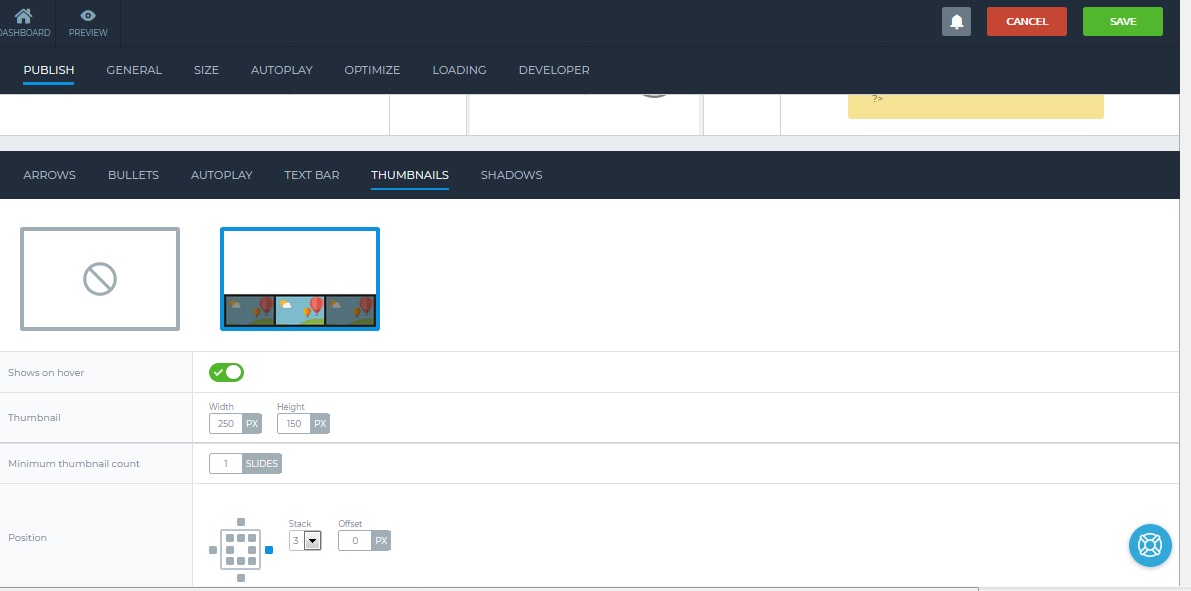
Those settings apply to the entire Slider. You may notice that I changed the colour or the Arrows to Pink here also (because of the white background created by the Images).
If you click on an individual slide you can configure all the elements of that slide. For the slider at bottom of this post, I wanted to configure the button:
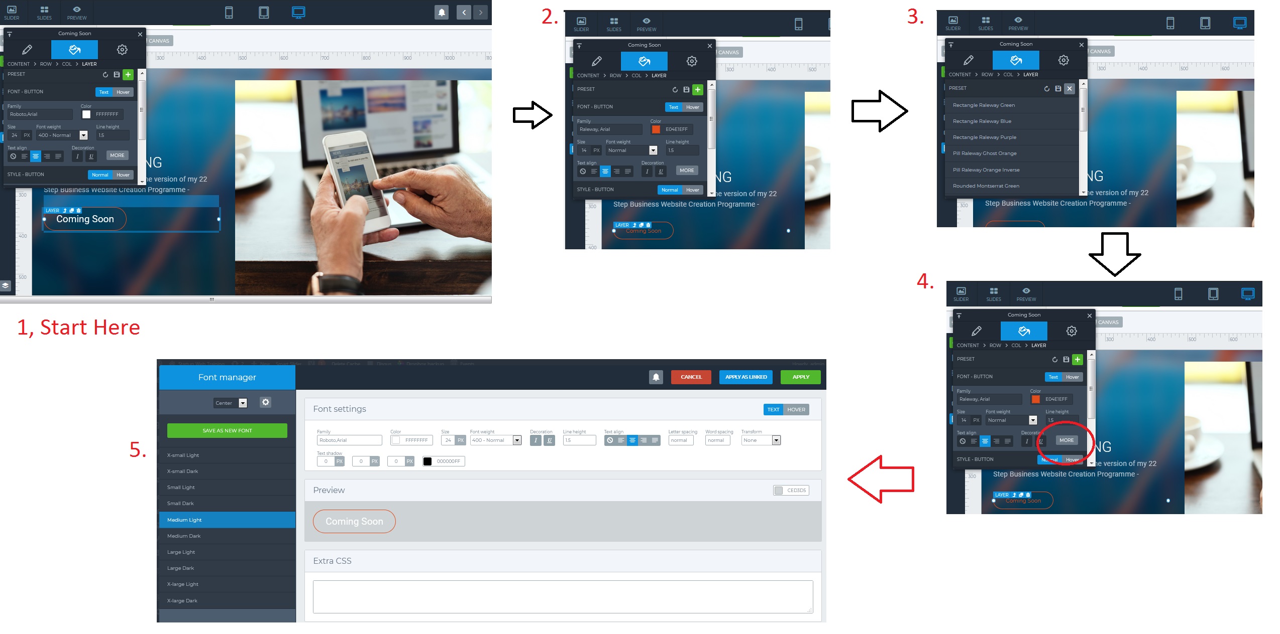
1 – Click on the Button Layer. A pop up menu appears. Click on the PAINT TAB/ICON (turns blue as per image)
2 – In the PRESET ROW Click the Green Plus Box Button (load design)
3 – I selected Pill Raleway Ghost Orange from amongst the many options that appeared in the drop down
4. Click on the More Button (circled in red) – a large pop up will appear
5. Select Medium Light from the Option List. You can preview all the styles. Click APPLY to save your choice. The slide can also be previewed via the Preview Button on the Top Menu of Smart Slider 3.
As you can see there are tonnes more settings along the way. BTW, when you hover over the image it brings up the Slide Description. To edit this:
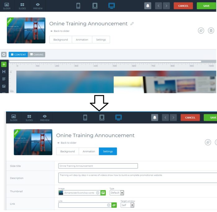
a. Select Slide and Click Green Edit Button
b. You would normally scroll down to edit the content of the slide, but Select SETTINGS to turn it blue as per image below. It drops down a menu to change Slide Title, Description and other items.
Works with the SiteOrigin Vantage Theme
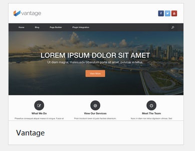
I first came across Smart Slider 3 when I was looking at the Vantage Theme by SiteOrigin the creators of the SiteOrigin Page Builder.
That is a Smart Slider 3 on the Homepage (Theme includes option to turn off the slider on home page)
The Debate – To use Sliders on HomePage or Not
I had read that Sliders are not effective. This excellent blog article by Thrive Themes (and YouTube video) makes the point very clearly that Sliders should not be used. Thankfully they give alternatives.
Call to Action Based Homepage
The Thrive Themes post explains that well crafted Hero Images with Text and Buttons (as created with a Page Builder like Site Origin) can be effective.
You can also use a Smart Slider 3 but limit it to one slide with a Strong Call to Action.
This is one with a background, a placeholder for a small image that resonates with your service or product; a Call to Action Headline and a button (not active) for more information.
As always hope you enjoyed this post. Comments and social shares welcome. I have included links to my two part blogpost on Working with Images for your WordPress site.
Best regards
donncha


